


Illumina just unveiled their latest sequencing machine, the HiSeq 2000, capable of sequencing two human genomes to 30x coverage in a single run for less than $10,000 each. Using reversible terminator-based sequencing by synthesis chemistry, the HiSeq 2000 is capable of quickly generating a flood of data: 200 Gb per run, 2 x 100 bp read length, up to 25 Gb per day, two billion paired-end reads/run. Just a few months ago I wrote about Illumina's $50,000 human genome. Like it or not, we need to prepare ourselves for dealing with this unprecedented amount of data that is only going to become cheaper and cheaper over the coming years.
Wall Street Journal: Illumina Unveils System to Cut Genome Sequencing Costs
Seminar: Health Disparities in the Genomic Era: What are we Learning?
This looks good.
208 Light Hall
Wednesday 1/13/2010, Noon
Charles Rotimi
Health Disparities in the Genomic Era: What are we Learning?
Charles Rotimi, PhD, a genetic epidemiologist and a biochemist, is a senior investigator in the Inherited Disease Branch of the NHGRI intramural program. He is the Director of the Center for Research on Genomics and Global Health (CRGGH). The mission of this new trans-NIH center is to advance research into the role of culture, lifestyle, genetics and genomics in disease etiology and health disparities. Dr. Rotimi develops genetic epidemiology models and conducts population genetics research that explores the patterns and determinants of common complex diseases in human populations with particular emphasis on populations of the African Diaspora. As a senior investigator and director of the CRGGH, Dr. Rotimi leads a team of researchers across multiple disciplines (Medicine, genetics/genomics, epidemiology, statistics and informatics) to understand the complex interactions between inherited characteristics and environmental factors in disease susceptibility, variable drug response and health disparities. For example, his team is engaged in the first genome-wide scan of an African American cohort, with the goal of identifying genes associated with obesity, hypertension, diabetes, and metabolic syndrome. Dr. Rotimi's lab continues to contribute to the global understanding of human genetic variation and its implication for differential disease distribution, variable drug response and human migration history. He is the current president of the African Society of Human Genetics (www.afshg.org).
208 Light Hall
Wednesday 1/13/2010, Noon
Charles Rotimi
Health Disparities in the Genomic Era: What are we Learning?
Charles Rotimi, PhD, a genetic epidemiologist and a biochemist, is a senior investigator in the Inherited Disease Branch of the NHGRI intramural program. He is the Director of the Center for Research on Genomics and Global Health (CRGGH). The mission of this new trans-NIH center is to advance research into the role of culture, lifestyle, genetics and genomics in disease etiology and health disparities. Dr. Rotimi develops genetic epidemiology models and conducts population genetics research that explores the patterns and determinants of common complex diseases in human populations with particular emphasis on populations of the African Diaspora. As a senior investigator and director of the CRGGH, Dr. Rotimi leads a team of researchers across multiple disciplines (Medicine, genetics/genomics, epidemiology, statistics and informatics) to understand the complex interactions between inherited characteristics and environmental factors in disease susceptibility, variable drug response and health disparities. For example, his team is engaged in the first genome-wide scan of an African American cohort, with the goal of identifying genes associated with obesity, hypertension, diabetes, and metabolic syndrome. Dr. Rotimi's lab continues to contribute to the global understanding of human genetic variation and its implication for differential disease distribution, variable drug response and human migration history. He is the current president of the African Society of Human Genetics (www.afshg.org).
ggplot2 Tutorial: Scatterplots in a Series of Small Multiples
It took several months after learning about ggplot2 before I gave it a try myself. I was apprehensive about learning a new graphics system with a new set of commands. Thing is, if you've ever used plot() in R, you already know how to use much of the functionality in ggplot2! In this tutorial I want to show you just how easy it is to start producing high-quality graphics using ggplot2. I'll also introduce the concept of a series of small multiples, and show you how ggplot2 makes it dead simple to produce these kinds of graphics yourself.
Getting started:
First of all, if you've never used ggplot2 before, you'll need to download and install it. Fire up R, and type this command, exactly as is, with the quotes:
Pick a mirror that's close to you, and install. Once you do this, or if you've already installed ggplot2 in the past, load the ggplot2 library (no quotes this time). You'll have to do this every time you start a new R session.
Now we need some data. Rather than making up our own data, let's use the "diamonds" dataset that comes packaged with ggplot2. Type this command:
This dataset contains ~50,000 entries. Each row is an individual diamond, and some of the variables of interest include the weight of the diamond in carats, color, clarity, and its price. We can get a very good picture of the relationship between these variables using some fairly simple plotting commands. First let's take a look at the first few rows of the dataset using the head() function.
Here's what the first few rows of the relevant columns look like:
The variables carat and price are both continuous variables, while color and clarity are discrete, or in R lingo, factor variables. Wikipedia has nice charts describing what these codes mean for a diamond's color and clarity.
First, let's take a look at the distribution of price using a histogram.
Using base graphics:
with(diamonds, hist(price))

And using the qplot function ggplot2:

You may have gotten a warning that you didn't specify the bin width. Hadley Wickham, ggplot2's creator, seems like a nice guy. He encourages you to specify how wide you want the bins, but even if you don't, ggplot2 will still make your plot using sensible defaults. Let's specify the binwidth ourselves this time:

That plot looks a lot like the defaults using base graphics. Now let's take a look at the relationship between the price of a diamond and its weight in carats.
Using base graphics:
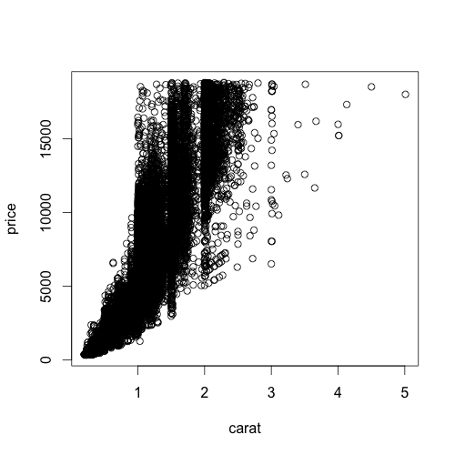
And using ggplot2:

Notice something about the ggplot2 syntax here. Using base R graphics there are different commands for scatterplots and histograms. But in ggplot2, if you specify a single continuous variable to the qplot command, you'll get a histogram. If you specify two continuous variables to the same qplot command, you get a scatterplot. The bars in a histogram and the points on a scatterplot are called "geoms" in ggplot2 lingo. You can specify exactly which geom you want to use, but since Hadley's such a nice guy, ggplot2 will often guess which type of "geom" you want to use based on the data type you give it. Let's say you wanted to look at the distribution of price using the kernel density estimation, rather than a histogram. The command is very similar to the command you used to get a histogram, you just specify "density" as the geom, instead of leaving this option out:
qplot(price, data=diamonds, geom="density")

As you can see, using different types of "geoms" with different data types allows you to break many graphical conventions. This is usually a bad thing, but this also allows you to be creative and design your own way to display data. Anyhow, let's get back to scatterplots.
Let's say you want to add labels and a main title to your plot using xlab, ylab, and main. If you know how to do this using base graphics, then you already know how to do this using ggplot2.
Using base graphics:

And using ggplot2:
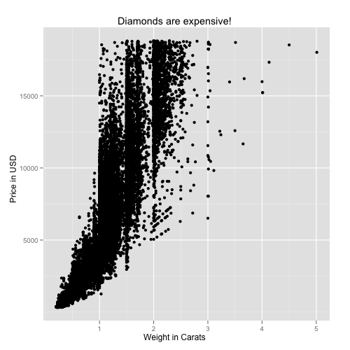
All we've done so far is to examine the relationship between carat and price. As one would expect, the price increases sharply as the size of the diamond increases. But what about the other variables here, color and clarity? Specifically, does color or clarity modify the effect of carat on price? In other words, is there an interaction between carat and either of these variables?
To visualize this graphically, we could plot price vs carat for each level of one of the other two vactors, color or clarity. In ggplot2 terminology, we could facet the plot by one of these factor variables. Let's look at color first. The facets option does just this. The syntax "color~." is saying that we want plots of price vs carat by color, where color is on the rows. If you wanted separate facets beside each other in columns, the syntax would look like ".~color".

This plot reveals something important about the relationship between these three variables. As the letters go from D to J, the diamond becomes more and more yellow. This plot shows us that as the diamond's color becomes more white, an increase in carat causes a faster increase in price. In other words, the color of the diamond modifies the effect of carat.
We can formally test in linear regression using the lm (linear model) command. Note that I'm treating color now as a continuous (numeric) variable. The output shows us that the interaction is significant at p<2e-16.
You can also do the same thing for clarity (omitting the statistical analysis):

As you go down the panels the diamond gets more and more clear. The numbers beside "S" (small) and "VS" (very small) describe the size of the "inclusions", or internal imperfections, in the stones. "IF" means internally flawless, a rare find. As you'd expect, as the diamond becomes more and more flawless, the price per carat dramatically increases.
Finally, as you'd imagine, you can facet by both color and clarity, one on the columns and one on the rows. You'll have to click on the image below to see it full-screen.

The bottom left panel shows price vs carat for very white, internally flawless diamonds. Notice how few observations are in this cell compared to others. These are extremely rare and expensive stones. Compare the relationship here with the relationship in the upper right facet, where you have the yellowest, and dirtiest diamonds. You can statistically test this one as well, and you'll find that there's a highly significant (p<1e-16) three-way interaction between carat, color, and clarity, that influences the price of the diamond.
This last plot above brings me to the topic in the title, "small multiples." This term, popularized by Edward Tufte, refers to visually displaying relationships in data using the same type of figure over and over again. The idea here is that you teach the reader once how to interpret each individual component. Once the reader is oriented to a single component, you can show small multiples of the same figure over and over again to display how relationships change based on certain factors, without requiring the reader to figure out how to decode a new graphic every time. The fact that the figure above distills 215,760 data points across 4 dimensions into a graphic that you can interpret within seconds proves that using small multiples can be a highly effective way to display large, high-dimensional data. Do an image search for small multiples to see many more examples. Tufte is cited in chapter 1 of the ggplot2 book, and it's very adept at displaying complex relationships in big data in an intuitive and effective manner.
I only used this diamonds dataset because it's free and readily available once you install ggplot2. There are so many ways you can use this technique for data visualization in genetics, where interactions between variables and their influence on traits are difficult to ignore. I hope I've convinced you that using ggplot2 is no harder than base graphics, and makes high-dimensional plotting very easy. If you've found this tutorial useful, let me know in the comments, and I'll try to post a few more like this later on.
Getting started:
First of all, if you've never used ggplot2 before, you'll need to download and install it. Fire up R, and type this command, exactly as is, with the quotes:
install.packages("ggplot2")
Pick a mirror that's close to you, and install. Once you do this, or if you've already installed ggplot2 in the past, load the ggplot2 library (no quotes this time). You'll have to do this every time you start a new R session.
library(ggplot2)
Now we need some data. Rather than making up our own data, let's use the "diamonds" dataset that comes packaged with ggplot2. Type this command:
data(diamonds)
This dataset contains ~50,000 entries. Each row is an individual diamond, and some of the variables of interest include the weight of the diamond in carats, color, clarity, and its price. We can get a very good picture of the relationship between these variables using some fairly simple plotting commands. First let's take a look at the first few rows of the dataset using the head() function.
head(diamonds)
Here's what the first few rows of the relevant columns look like:
   carat price color clarity
1   0.23   326     E     SI2
2   0.21   326     E     SI1
3   0.23   327     E     VS1
4   0.29   334     I     VS2
5   0.31   335     J     SI2
6   0.24   336     J    VVS2
7   0.24   336     I    VVS1
8   0.26   337     H     SI1
9   0.22   337     E     VS2
10  0.23   338     H     VS1
The variables carat and price are both continuous variables, while color and clarity are discrete, or in R lingo, factor variables. Wikipedia has nice charts describing what these codes mean for a diamond's color and clarity.
First, let's take a look at the distribution of price using a histogram.
Using base graphics:
with(diamonds, hist(price))
And using the qplot function ggplot2:
qplot(price, data=diamonds)
You may have gotten a warning that you didn't specify the bin width. Hadley Wickham, ggplot2's creator, seems like a nice guy. He encourages you to specify how wide you want the bins, but even if you don't, ggplot2 will still make your plot using sensible defaults. Let's specify the binwidth ourselves this time:
qplot(price, data=diamonds, binwidth=1000)
That plot looks a lot like the defaults using base graphics. Now let's take a look at the relationship between the price of a diamond and its weight in carats.
Using base graphics:
with(diamonds, plot(carat,price))
And using ggplot2:
qplot(carat, price, data=diamonds)
Notice something about the ggplot2 syntax here. Using base R graphics there are different commands for scatterplots and histograms. But in ggplot2, if you specify a single continuous variable to the qplot command, you'll get a histogram. If you specify two continuous variables to the same qplot command, you get a scatterplot. The bars in a histogram and the points on a scatterplot are called "geoms" in ggplot2 lingo. You can specify exactly which geom you want to use, but since Hadley's such a nice guy, ggplot2 will often guess which type of "geom" you want to use based on the data type you give it. Let's say you wanted to look at the distribution of price using the kernel density estimation, rather than a histogram. The command is very similar to the command you used to get a histogram, you just specify "density" as the geom, instead of leaving this option out:
qplot(price, data=diamonds, geom="density")
As you can see, using different types of "geoms" with different data types allows you to break many graphical conventions. This is usually a bad thing, but this also allows you to be creative and design your own way to display data. Anyhow, let's get back to scatterplots.
Let's say you want to add labels and a main title to your plot using xlab, ylab, and main. If you know how to do this using base graphics, then you already know how to do this using ggplot2.
Using base graphics:
with(diamonds, plot(carat,price, xlab="Weight in Carats", ylab="Price in USD", main="Diamonds are expensive!"))
And using ggplot2:
qplot(carat, price, data=diamonds, xlab="Weight in Carats", ylab="Price in USD", main="Diamonds are expensive!")
All we've done so far is to examine the relationship between carat and price. As one would expect, the price increases sharply as the size of the diamond increases. But what about the other variables here, color and clarity? Specifically, does color or clarity modify the effect of carat on price? In other words, is there an interaction between carat and either of these variables?
To visualize this graphically, we could plot price vs carat for each level of one of the other two vactors, color or clarity. In ggplot2 terminology, we could facet the plot by one of these factor variables. Let's look at color first. The facets option does just this. The syntax "color~." is saying that we want plots of price vs carat by color, where color is on the rows. If you wanted separate facets beside each other in columns, the syntax would look like ".~color".
qplot(carat, price, data=diamonds, facets=color~.)
This plot reveals something important about the relationship between these three variables. As the letters go from D to J, the diamond becomes more and more yellow. This plot shows us that as the diamond's color becomes more white, an increase in carat causes a faster increase in price. In other words, the color of the diamond modifies the effect of carat.
We can formally test in linear regression using the lm (linear model) command. Note that I'm treating color now as a continuous (numeric) variable. The output shows us that the interaction is significant at p<2e-16.
fit1=lm(price~carat*as.numeric(color), data=diamonds)
summary(fit1)

Call:
lm(formula = price ~ carat * as.numeric(color), data = diamonds)

Residuals:
      Min        1Q    Median        3Q       Max
-15445.88   -813.27    -20.89    634.69  11740.29

Coefficients:
                         Estimate Std. Error t value Pr(>|t|)
(Intercept)             -2532.529     29.871 -84.782   <2e-16 ***
carat                    9276.490     35.789 259.202   <2e-16 ***
as.numeric(color)          -3.227      7.445  -0.433    0.665
carat:as.numeric(color)  -298.153      7.777 -38.340   <2e-16 ***
---
Signif. codes:  0 ‘***’ 0.001 ‘**’ 0.01 ‘*’ 0.05 ‘.’ 0.1 ‘ ’ 1

Residual standard error: 1476 on 53936 degrees of freedom
Multiple R-squared: 0.8631,     Adjusted R-squared: 0.8631
F-statistic: 1.134e+05 on 3 and 53936 DF,  p-value: < 2.2e-16
You can also do the same thing for clarity (omitting the statistical analysis):
qplot(carat, price, data=diamonds, facets=clarity~.)
As you go down the panels the diamond gets more and more clear. The numbers beside "S" (small) and "VS" (very small) describe the size of the "inclusions", or internal imperfections, in the stones. "IF" means internally flawless, a rare find. As you'd expect, as the diamond becomes more and more flawless, the price per carat dramatically increases.
Finally, as you'd imagine, you can facet by both color and clarity, one on the columns and one on the rows. You'll have to click on the image below to see it full-screen.
qplot(carat, price, data=diamonds, facets=clarity~color)

The bottom left panel shows price vs carat for very white, internally flawless diamonds. Notice how few observations are in this cell compared to others. These are extremely rare and expensive stones. Compare the relationship here with the relationship in the upper right facet, where you have the yellowest, and dirtiest diamonds. You can statistically test this one as well, and you'll find that there's a highly significant (p<1e-16) three-way interaction between carat, color, and clarity, that influences the price of the diamond.
This last plot above brings me to the topic in the title, "small multiples." This term, popularized by Edward Tufte, refers to visually displaying relationships in data using the same type of figure over and over again. The idea here is that you teach the reader once how to interpret each individual component. Once the reader is oriented to a single component, you can show small multiples of the same figure over and over again to display how relationships change based on certain factors, without requiring the reader to figure out how to decode a new graphic every time. The fact that the figure above distills 215,760 data points across 4 dimensions into a graphic that you can interpret within seconds proves that using small multiples can be a highly effective way to display large, high-dimensional data. Do an image search for small multiples to see many more examples. Tufte is cited in chapter 1 of the ggplot2 book, and it's very adept at displaying complex relationships in big data in an intuitive and effective manner.
I only used this diamonds dataset because it's free and readily available once you install ggplot2. There are so many ways you can use this technique for data visualization in genetics, where interactions between variables and their influence on traits are difficult to ignore. I hope I've convinced you that using ggplot2 is no harder than base graphics, and makes high-dimensional plotting very easy. If you've found this tutorial useful, let me know in the comments, and I'll try to post a few more like this later on.
Seminar: Next-gen sequencing at VUMC: Our experience with RNA-, ChIP- and DNA-seq
The Vanderbilt Genome Technology Core is hosting a seminar/workshop on next-generation sequencing where Vanderbilt investigators will share their experiences with several types of next-gen technologies. You can visit the Genome Technology Core at http://gtc.vanderbilt.edu/.
Monday, January 11
3:00 p.m.
208 Light Hall
Next-Generation Sequencing at VUMC: Our experience with RNA-, ChIP- and DNA-seq
presented by
Al George Jr MD, Genetic Medicine
Ron Emeson PhD, Pharmacology
Josie Eid MD, Cancer Biology
Dan Roden MD, Clinical Pharmacology
Monday, January 11
3:00 p.m.
208 Light Hall
Next-Generation Sequencing at VUMC: Our experience with RNA-, ChIP- and DNA-seq
presented by
Al George Jr MD, Genetic Medicine
Ron Emeson PhD, Pharmacology
Josie Eid MD, Cancer Biology
Dan Roden MD, Clinical Pharmacology
Finding unique filter sets in PLATO: a precursor to efficient interaction analysis in GWAS data
Ben's paper was published today in the 2010 proceedings of the Pacific Symposium in Biocomputing. You can download the PDF here.
Finding unique filter sets in PLATO: a precursor to efficient interaction analysis in GWAS data
Benjamin J. Grady, Eric Torstenson, Scott M. Dudek, Justin Giles, David Sexton, Marylyn D. Ritchie
ABSTRACT: The methods to detect gene-gene interactions between variants in genome-wide association study (GWAS) datasets have not been well developed thus far. PLATO, the Platform for the Analysis, Translation and Organization of large-scale data, is a filter-based method bringing together many analytical methods simultaneously in an effort to solve this problem. PLATO filters a large, genomic dataset down to a subset of genetic variants, which may be useful for interaction analysis. As a precursor to the use of PLATO for the detection of gene-gene interactions, the implementation of a variety of single locus filters was completed and evaluated as a proof of concept. To streamline PLATO for efficient epistasis analysis, we determined which of 24 analytical filters produced redundant results. Using a kappa score to identify agreement between filters, we grouped the analytical filters into 4 filter classes; thus all further analyses employed four filters. We then tested the MAX statistic put forth by Sladek et al. 1 in simulated data exploring a number of genetic models of modest effect size. To find the MAX statistic, the four filters were run on each SNP in each dataset and the smallest p-value among the four results was taken as the final result. Permutation testing was performed to empirically determine the p-value. The power of the MAX statistic to detect each of the simulated effects was determined in addition to the Type 1 error and false positive rates. The results of this simulation study demonstrates that PLATO using the four filters incorporating the MAX statistic has higher power on average to find multiple types of effects and a lower false positive rate than any of the individual filters alone. In the future we will extend PLATO with the MAX statistic to interaction analyses for large-scale genomic datasets.
Finding unique filter sets in PLATO: a precursor to efficient interaction analysis in GWAS data
Benjamin J. Grady, Eric Torstenson, Scott M. Dudek, Justin Giles, David Sexton, Marylyn D. Ritchie
ABSTRACT: The methods to detect gene-gene interactions between variants in genome-wide association study (GWAS) datasets have not been well developed thus far. PLATO, the Platform for the Analysis, Translation and Organization of large-scale data, is a filter-based method bringing together many analytical methods simultaneously in an effort to solve this problem. PLATO filters a large, genomic dataset down to a subset of genetic variants, which may be useful for interaction analysis. As a precursor to the use of PLATO for the detection of gene-gene interactions, the implementation of a variety of single locus filters was completed and evaluated as a proof of concept. To streamline PLATO for efficient epistasis analysis, we determined which of 24 analytical filters produced redundant results. Using a kappa score to identify agreement between filters, we grouped the analytical filters into 4 filter classes; thus all further analyses employed four filters. We then tested the MAX statistic put forth by Sladek et al. 1 in simulated data exploring a number of genetic models of modest effect size. To find the MAX statistic, the four filters were run on each SNP in each dataset and the smallest p-value among the four results was taken as the final result. Permutation testing was performed to empirically determine the p-value. The power of the MAX statistic to detect each of the simulated effects was determined in addition to the Type 1 error and false positive rates. The results of this simulation study demonstrates that PLATO using the four filters incorporating the MAX statistic has higher power on average to find multiple types of effects and a lower false positive rate than any of the individual filters alone. In the future we will extend PLATO with the MAX statistic to interaction analyses for large-scale genomic datasets.
Seminar: Sample size estimation and power analysis
The 2010 Cancer Biostatistics Workshop seminar series begins next Friday with a workshop by Ayumi Shintani on sample size estimation and power analysis. Here's the entire 2010 workshop schedule. Be sure to check out my previous post on software for power calculations in genetic analysis.
Friday, January 15th, 2010
1:00 to 2:00 PM
898-B Preston Research Building
Sample size estimation and power analysis
Ayumi Shintani, PhD, MPH
Associate Professor
Department of Biostatistics
Cancer Biostatistics Center, Vanderbilt-Ingram Cancer Center
Friday, January 15th, 2010
1:00 to 2:00 PM
898-B Preston Research Building
Sample size estimation and power analysis
Ayumi Shintani, PhD, MPH
Associate Professor
Department of Biostatistics
Cancer Biostatistics Center, Vanderbilt-Ingram Cancer Center
New Features in ggplot2 0.8.5
Learning R blog details some of the new features in the latest update to ggplot2. The latest version includes functions to make it easier to change axis and legend labels, as well as a function to easily set the limits of the plot display outside the range of the data.
Be sure to check back next week - I'm putting together a short introductory ggplot2 tutorial.
Be sure to check back next week - I'm putting together a short introductory ggplot2 tutorial.
Subscribe to:
Posts (Atom)