Pages

Plotting the Frequency of Twitter Hashtag Usage Over Time with R and ggplot2

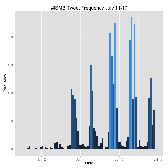
The 20th annual ISMB meeting was held over the last week in Long Beach, CA. It was an incredible meeting with lots of interesting and relevant talks, and lots of folks were tweeting the conference, usually with at least a few people in each concurrent session. I wrote the code below that uses the twitteR package to pull all the tweets about the meeting under the #ISMB hashtag. You can download that raw data here. I then use ggplot2 to plot the frequency of tweets about #ISMB over time in two hour windows for each day of the last week.

The code below also tabulates the total number of tweets by username, and plots the 40 most prolific. Interestingly several of the folks in this list weren't even at the meeting.


I'll update the plots above at the conclusion of the meeting.

Here's the code below. There's a limitation with this code - you can only retrieve a maximum of 1500 tweets per query without authenticating via OAuth before you receive a 403 error. The twitteR package had a good vignette about how to use the ROAuth package to do this, but I was never able to get it to work properly. The version on CRAN (0.9.1) has known issues, but even when rolling back to 0.9.0 or upgrading to 0.9.2 from the author's homepage, I still received the 403 signal. So my hackjob workaround was to write a loop to fetch all the tweets one day at a time and then flatten this into a single list before converting to a data frame. You still run into the limitation of only being able to retrieve the first 1500 for each day, but #ISMB never had more than 1500 any one day. If you can solve my ROAuth problem, please leave a comment or fork the code on GitHub.



Fix Overplotting with Colored Contour Lines

I saw this plot in the supplement of a recent paper comparing microarray results to RNA-seq results. Nothing earth-shattering in the paper - you've probably seen a similar comparison many times before - but I liked how they solved the overplotting problem using heat-colored contour lines to indicate density. I asked how to reproduce this figure using R on Stack Exchange, and my question was quickly answered by Christophe Lalanne.

Here's the R code to generate the data and all the figures here.


Here's the problem: there are 50,000 points in this plot causing extreme overplotting. (This is a simple multivariate normal distribution, but if the distribution were more complex, overplotting might obscure a relationship in the data that you didn't know about).
I liked the solution they used in the paper referenced above. Contour lines were placed throughout the data indicating the density of the data in that region. Further, the contour lines were "heat" colored from blue to red, indicating increasing data density. Optionally, you can add vertical and horizontal lines that intersect the means, and a legend that includes the absolute correlation coefficient between the two variables.

There are many other ways to solve an overplotting problem - reducing the size of the points, making points transparent, using hex-binning. 


Using a single pixel for each data point:


Using hexagonal binning to display density (hexbin package):


Finally, using semi-transparency (10% opacity; easiest using the ggplot2 package):


Edit July 7, 2012 - From Pete's comment below, the smoothScatter() function in the build in graphics package produces a smoothed color density representation of the scatterplot, obtained through a kernel density estimate. You can change the colors using the colramp option, and change how many outliers are plotted with the nrpoints option. Here, 100 outliers are plotted as single black pixels - outliers here being points in the areas of lowest regional density.


How do you deal with overplotting when you have many points?