Pages

Learn R and Python, and Have Fun Doing It

If you need to catch up on all those years you spent not learning how to code (you need to know how to code), here are a few resources to help you quickly learn R and Python, and have a little fun doing it.

First, the free online Coursera course Computing for Data Analysis just started. The 4 week course is being taught by Roger Peng, associate professor of biostatistics at Johns Hopkins, and blogger at Simply Statistics. From the course description:
This course is about learning the fundamental computing skills necessary for effective data analysis. You will learn to program in R and to use R for reading data, writing functions, making informative graphs, and applying modern statistical methods.
Here's a short video about the course from the instructor:


Next, for quickly learning Python, there's the Python track on Codeacademy. Codeacademy takes an interactive approach to teaching coding. The interface gives you some basic instruction and prompts you to enter short code snippets to accomplish a task. Codeacademy makes learning to code fun by giving you short projects to complete (e.g. a tip calculator), and rewarding you with badges for your accomplishments, which allow you to "compete" with friends.

Once you've learned some basic skills, you really only get better with practice and problem solving. Project Euler has been around for some time, and you can find many solutions out there on the web using many different languages, but the problems are more purely mathematical in nature. For short problems perhaps more relevant, head over to Rosalind.info for some bioinformatics programming challenges ranging from something as simple as counting nucleotides or computing GC content, to something more difficult, such as genome assembly.

Coursera: Computing for Data Analysis

Codeacademy Python Track

Rosalind.info bioinformatics programming challenges

DESeq vs edgeR Comparison

Update (Dec 18, 2012): Please see this related post I wrote about differential isoform expression analysis with Cuffdiff 2.

DESeq and edgeR are two methods and R packages for analyzing quantitative readouts (in the form of counts) from high-throughput experiments such as RNA-seq or ChIP-seq. After alignment, reads are assigned to a feature, where each feature represents a target transcript, in the case of RNA-Seq, or a binding region, in the case of ChIP-Seq. An important summary statistic is the count of the number of reads in a feature (for RNA-Seq, this read count is a good approximation of transcript abundance).

Methods used to analyze array-based data assume a normally distributed, continuous response variable. However, response variables for digital methods like RNA-seq and ChIP-seq are discrete counts. Thus, both DESeq and edgeR methods are based on the negative binomial distribution.

I see these two tools often used interchangeably, and I wanted to take a look at how they stack up to one another in terms of performance, ease of use, and speed. This isn't meant to be a comprehensive evaluation or "bake-off" between the two methods. This would require complex simulations, parameter sweeps, and evaluation with multiple well-characterized real RNA-seq datasets. Further, this is only a start - a full evaluation would need to be much more comprehensive.

Here, I used the newest versions of both edgeR and DESeq, using the well-characterized Pasilla dataset, available in the pasilla Bioconductor package. The dataset is from an experiment in Drosophila investigating the effect of RNAi knockdown of the splicing factor, pasilla. I used the GLM functionality of both packages, as recommended by the vignettes, for dealing with a multifactorial experiment (condition: treated vs. untreated; library type: single-end and paired-end).


Both packages provide built-in functions for assessing overall similarity between samples using either PCA (DESeq) or MDS (edgeR), although these methods operate on the same underlying data and could easily be switched.

PCA plot on variance stabilized data from DESeq:

MDS plot from edgeR:


Per gene dispersion estimates from DESeq:

Biological coefficient of variation versus abundance (edgeR):


Now, let's see how many statistically significant (FDR<0.05) results each method returns:


In this simple example, DESeq finds 820 genes significantly differentially expressed at FDR<0.05, while edgeR is finds these 820 and an additional 371. Let's take a look at the detected fold changes from both methods:

Here, if genes were found differentially expressed by edgeR only, they're colored red; if found by both, colored green. What's striking here is that for a handful of genes, DESeq is (1) reporting massive fold changes, and (2) not calling them statistically significant. What's going on here?

It turns out that these genes have extremely low counts (usually one or two counts in only one or two samples). The DESeq vignette goes through the logic of independent filtering, showing that the likelihood of a gene being significantly differentially expressed is related to how strongly it's expressed, and advocates for discarding extremely lowly expressed genes, because differential expression is likely not statistically detectable.

Count-based filtering can be achieved two ways. The DESeq vignette demonstrates how to filter based on quantiles, while I used the filtering method demonstrated in the edgeR vignette - removing genes without at least 2 counts per million in at least two samples. This filtering code is commented out above - uncomment to filter.

After filtering, all of the genes shown above with apparently large fold changes as detected by DESeq are removed prior to filtering, and the fold changes correlate much better between the two methods. edgeR still detects ~50% more differentially expressed genes, and it's unclear to me (1) why this is the case, and (2) if this is necessarily a good thing.


Conclusions:

Unfortunately, I may have oversold the title here - this is such a cursory comparison of the two methods that I would hesitate to draw any conclusions about which method is better than the other. In addition to finding more significantly differentially expressed genes (again, not necessarily a good thing), I can say that edgeR was much faster than DESeq for fitting GLM models, but it took slightly longer to estimate the dispersion. Further without any independent filtering, edgeR gave me moderated fold changes for the extremely lowly expressed genes for which DESeq returned logFCs in the 20-30 range (but these transcripts were so lowly expressed anyway, they should have been filtered out before any evaluation).

If there's one thing that will make me use edgeR over DESeq (until I have time to do a more thorough evaluation), it's the fact that using edgeR seems much more natural than DESeq, especially if you're familiar with the limma package (pretty much the standard for analyzing microarray data and other continuously distributed gene expression data). Setting up the design matrix and specifying contrasts feels natural if you're familiar with using limma. Further, the edgeR user guide weighs in at 67 pages, filled with many case studies that will help you in putting together a design matrix for nearly any experimental design: paired designs, time courses, batch effects, interactions, etc. The DESeq documentation is still fantastic, but could benefit from a few more case studies / examples.

What do you think? Anyone want to fork my R code and help do this comparison more comprehensively (more examples, simulated data, speed benchmarking)? Is the analysis above fair? What do you find more easy to use, or is ease-of-use (and thus, reproducibility) even important when considering data analysis?

More on Exploring Correlations in R

About a year ago I wrote a post about producing scatterplot matrices in R. These are handy for quickly getting a sense of the correlations that exist in your data. Recently someone asked me to pull out some relevant statistics (correlation coefficient and p-value) into tabular format to publish beside a scatterplot matrix. The built-in cor() function will produce a correlation matrix, but what if you want p-values for those correlation coefficients? Also, instead of a matrix, how might you get these statistics in tabular format (variable i, variable j, r, and p, for each i-j combination)? Here's the code (you'll need the PerformanceAnalytics package to produce the plot).


The cor() function will produce a basic correlation matrix.  12 years ago Bill Venables provided a function on the R help mailing list for replacing the upper triangle of the correlation matrix with the p-values for those correlations (based on the known relationship between t and r). The cor.prob() function will produce this matrix.

Finally, the flattenSquareMatrix() function will "flatten" this matrix to four columns: one column for variable i, one for variable j, one for their correlation, and another for their p-value (thanks to Chris Wallace on StackOverflow for helping out with this one).


Finally, the chart.Correlation() function from the PerformanceAnalytics package produces a very nice scatterplot matrix, with histograms, kernel density overlays, absolute correlations, and significance asterisks (0.05, 0.01, 0.001):

Cscan: Finding Gene Expression Regulators with ENCODE ChIP-Seq Data

Recently published in Nucleic Acids Research:

F. Zambelli, G. M. Prazzoli, G. Pesole, G. Pavesi, Cscan: finding common regulators of a set of genes by using a collection of genome-wide ChIP-seq datasets., Nucleic acids research 40, W510–5 (2012).

Cscan web interface screenshot

This paper presents a methodology and software implementation that allows users to discover a set of transcription factors or epigenetic modifications that regulate a set of genes of interest. A wealth of data about transcription factor binding exists in the public domain, and this is a good example of a group utilizing those resources to develop tools that are of use to the broader computational biology community. 

High-throughput gene expression experiments like microarrays and RNA-seq experiments often result in a list of differentially regulated or co-expressed genes. A common follow-up question asks which transcription factors may regulate those genes of interest. The ENCODE project has completed ChIP-seq experiments for many transcription factors and epigenetic modifications for a number of different cell lines in both human and model organisms. These researchers crossed this publicly available data on enriched regions from ChIP-seq experiments with genomic coordinates of gene annotations to create a table of gene annotations (rows) by ChIP-peak signals, with a presence/absence peak in each cell. Given a set of genes of interest (e.g. differentially regulated genes from an RNA-seq experiment), the method evaluates the over-/under-representation of target sites for the DNA binding protein in each ChIP experiment using a Fisher's exact test. Other methods based on motif-enrichment (using position weight matrices derived from databases like TRANSFAC or JASPAR) would miss DNA-binding factors like the Retinoblastoma protein (RB), which lacks a DNA-binding domain and is recruited to promoters by other transcription factors. In addition to overcoming this limitation, the method presented here also has the advantage of considering tissue-specificity and chromatin accessibility.

The web interface is free and doesn't require registration: http://www.beaconlab.it/cscan

Plotting the Frequency of Twitter Hashtag Usage Over Time with R and ggplot2

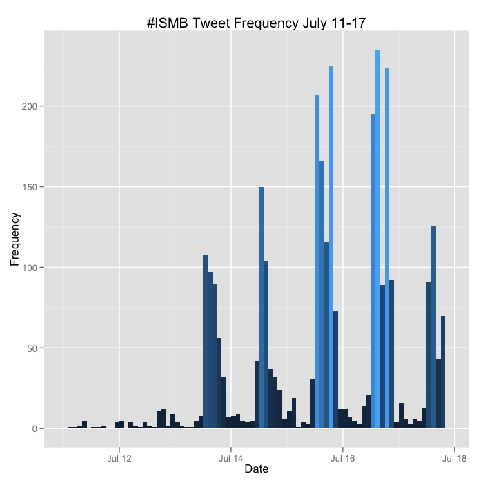
The 20th annual ISMB meeting was held over the last week in Long Beach, CA. It was an incredible meeting with lots of interesting and relevant talks, and lots of folks were tweeting the conference, usually with at least a few people in each concurrent session. I wrote the code below that uses the twitteR package to pull all the tweets about the meeting under the #ISMB hashtag. You can download that raw data here. I then use ggplot2 to plot the frequency of tweets about #ISMB over time in two hour windows for each day of the last week.

The code below also tabulates the total number of tweets by username, and plots the 40 most prolific. Interestingly several of the folks in this list weren't even at the meeting.


I'll update the plots above at the conclusion of the meeting.

Here's the code below. There's a limitation with this code - you can only retrieve a maximum of 1500 tweets per query without authenticating via OAuth before you receive a 403 error. The twitteR package had a good vignette about how to use the ROAuth package to do this, but I was never able to get it to work properly. The version on CRAN (0.9.1) has known issues, but even when rolling back to 0.9.0 or upgrading to 0.9.2 from the author's homepage, I still received the 403 signal. So my hackjob workaround was to write a loop to fetch all the tweets one day at a time and then flatten this into a single list before converting to a data frame. You still run into the limitation of only being able to retrieve the first 1500 for each day, but #ISMB never had more than 1500 any one day. If you can solve my ROAuth problem, please leave a comment or fork the code on GitHub.


Fix Overplotting with Colored Contour Lines

I saw this plot in the supplement of a recent paper comparing microarray results to RNA-seq results. Nothing earth-shattering in the paper - you've probably seen a similar comparison many times before - but I liked how they solved the overplotting problem using heat-colored contour lines to indicate density. I asked how to reproduce this figure using R on Stack Exchange, and my question was quickly answered by Christophe Lalanne.

Here's the R code to generate the data and all the figures here.


Here's the problem: there are 50,000 points in this plot causing extreme overplotting. (This is a simple multivariate normal distribution, but if the distribution were more complex, overplotting might obscure a relationship in the data that you didn't know about).
I liked the solution they used in the paper referenced above. Contour lines were placed throughout the data indicating the density of the data in that region. Further, the contour lines were "heat" colored from blue to red, indicating increasing data density. Optionally, you can add vertical and horizontal lines that intersect the means, and a legend that includes the absolute correlation coefficient between the two variables.

There are many other ways to solve an overplotting problem - reducing the size of the points, making points transparent, using hex-binning. 


Using a single pixel for each data point:


Using hexagonal binning to display density (hexbin package):


Finally, using semi-transparency (10% opacity; easiest using the ggplot2 package):


Edit July 7, 2012 - From Pete's comment below, the smoothScatter() function in the build in graphics package produces a smoothed color density representation of the scatterplot, obtained through a kernel density estimate. You can change the colors using the colramp option, and change how many outliers are plotted with the nrpoints option. Here, 100 outliers are plotted as single black pixels - outliers here being points in the areas of lowest regional density.


How do you deal with overplotting when you have many points?

Browsing dbGAP Results


Thanks to the excellent work of Lucia Hindorff and colleagues at NHGRI, the GWAS catalog provides a great reference for the cumulative results of GWAS for various phenotypes.  Anyone familiar with GWAS also likely knows about dbGaP – the NCBI repository for genotype-phenotype relationships – and the wealth of data it contains.  While dbGaP is often thought of as a way to get access to existing genotype data, analysis results are often deposited into dbGaP as well.  Individual-level data (like genotypes) are generally considered “controlled access”, requiring special permission to retrieve or use.  Summary-level data, such as association p-values, are a bit more accessible.  There are two tools available from the dbGaP website: the Association Results Browser and the Phenotype-GenotypeIntegrator (PheGenI).  These tools provide a search interface for examining previous GWAS associations. 

The Association Results Browser provides a simple table listing of associations, searchable by SNP, gene, or phenotype.  It contains the information from the NHGRI GWAS catalog, as well as additional associations from dbGaP deposited studies.  I’ve shown an example below for multiple sclerosis.  You can restrict the search to the dbGaP-specific results by changing the “Source” selection.  If you are looking for the impact of a SNP, this is a nice supplement to the catalog.  Clicking on a p-value brings up the GaP browser, which provides a more graphical (but perhaps less useful) view of the data.


The PheGenI tool provides similar search functionality, but attempts to provide phenotype categories rather than more specific phenotype associations.  Essentially, phenotype descriptions are linked to MeSH terms to provide categories such as “Chemicals and Drugs”, or “Hemic and Lymphatic Diseases”.  PheGenI seems most useful if searching from the phenotype perspective, while the association browser seems better for SNP or Gene searches.  All these tools are under active development, and I look forward to seeing their future versions.